Create an Effective Call to Action like an Expert

Drive more online visitors, leads, and customers further down the business funnel by creating a strategic call-to-action inbound marketing campaign. Here are some CTA best practices to help improve campaign effectiveness and generate leads.
What is a Call to Action?
Calls to action are short phrases or words that entice a web visitor to take an action. Some basic examples are “buy,” “download,” “subscribe,” “start a free trial,” or “join.” The words or phrases usually appear in a link or button on an email, website, blog, or other marketing tool. The CTA links the words or phrases to a landing page where visitors receive higher-value information. On the landing page, if the product or service is enticing enough, the visitor will fill out a form, request information or make a phone call — thus moving them further along the sales funnel.
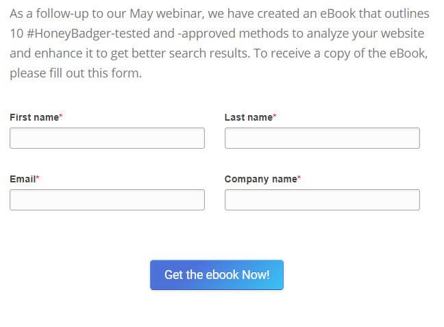
Example of a CTA with a form

Call-to-action phrases should be specific and, when appropriate, create a sense of urgency. When creating a call to action, decide what you want visitors to do and what they will get when they take the action.
Here are a few examples of premium offers and calls to action that might get people to click:
- Offer a 10-day free trial — “Start a free trial”
- Exclusive recorded webinar — “Download webinar”
- Offer an easy way to connect and make an appointment — “Make an appointment”
- Demonstrate a special product or service — “Request a demo”
Example of CTA
Best practices for Call-to-Action
Create CTAs that adhere with these best practices for the best results.
- Stand out from the crowd. The CTA should stand out on the web page. Be careful not to go overboard with size – as you don’t want the CTA to overpower the web page
- Keep your CTA benefit-orientated. For example, “Download eBook,” or “Stay Connected”
- Copy or messaging should be brief. Try to keep copy under five words
- Location, location. If the CTA isn’t in the right location, at the right time, your opportunity might be lost
- Use a contrasting color for the CTA button or link
- Use an image or custom design to make your CTA stand out
Try A/B Testing
Concerned about effectiveness and appropriate messaging? CTAs are not “one size fits all,” meaning what works for one business might not work for another. For example, XYZ Company might have success with a purple call-to-action button, placed in the right corner of an email. ABC Company might find that the same CTA button in the same purple color and position never gets a click. Conducting A/B tests can help you determine the best messaging, design, and placement for a CTA. A/B testing is the process of testing two different messages, buttons, links and landing pages to determine which CTA works best to drive clicks or conversions. By performing an A/B test, a marketer can effectively increase the results of a CTA campaign.
Multiple CTAs? No problem
Have more than one CTA on a page? While there is no limit to the number of CTA links or buttons that can appear on any page, it’s important to not overdo it. When using more than one CTA, there is usually a primary and a secondary call-to-action. Having a secondary CTA provides an alternative to the primary CTA, giving visitors an option of one or the other. The secondary CTA is usually less prominent on the page. The idea is to capture online leads who may not have found the primary CTA appealing enough to take action.
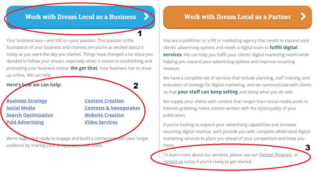
Example of Secondary CTA
Calls to action are an important component of any inbound marketing strategy. CTAs can help convert leads into customers. Contact our Dream Local Digital marketing team to help with a CTA strategy that works best for any business, get a free consultation.
Newsletter Signup
Stay up to date on the latest digital marketing news, updates, and more. Sign up to receive our newsletter!


