The Psychology Of an Effective Call to Action That Drives More Conversions
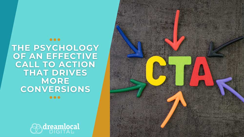
A call to action is usually brief, but those few words play a big role.
“Learn More.” “Get Started.” “Book a Consultation.” “Download the Guide.”
Each one prompts a next step, but a strong call to action does more than point out where to click. The words you choose, where you put the CTA, and how much you ask from someone all influence whether they act or keep scrolling.
At Dream Local Digital, we view calls to action as part of the entire customer journey. Before clicking, people often wonder: Do I know what happens next? Is this worth my time? What am I agreeing to? Do I trust this business?
Understanding the psychology of calls to action helps businesses answer these questions before hesitation gets in the way.
Why Does Clarity Matter in a Call to Action?
When people feel unsure, they hesitate.
Imagine arriving on a website and seeing a button that simply says “Continue.” Where are you continuing to? Are you starting a purchase? Filling out a form? Scheduling a sales call?
If people have to stop and guess what happens after they click, they’re more likely to skip it.
Studies show that giving clear instructions makes it easier for people to take action. But if you offer too many choices, it can get confusing, and people may not act at all.
That’s why clarity is one of the simplest principles of CTA psychology. Whether someone finds your business through organic search or paid ads, a clear call to action helps them understand what to do next once they reach your website.
If you want someone to schedule a consultation, say that. If they’re downloading a checklist, tell them. If they’re registering for an event, make that next step obvious.
Customers shouldn’t have to figure out a puzzle before deciding to click.
Specific CTA Language Gives People a Reason to Act
There’s a big difference between telling someone what to do and telling them what they’ll get.
Generic CTAs like “Submit,” “Click Here,” or “Continue” tell people what to do but don’t explain the value.
Compare “Submit” with “Get My Free Guide.”
The first tells the customer what to do. The second tells them what they’ll get. This small change can make the action feel different.
Using value-focused language works well for downloads, sign-ups, and other offers with a clear benefit. Phrases like “Download the Checklist,” “Save My Seat,” “Start My Free Trial,” or “See Available Options” tell people what to expect next.
The goal isn’t to be clever with your CTA. It’s to make the next step clear and easy to understand.
Match Your CTA to Where the Customer Is in the Buying Journey
Not every visitor is ready to “Buy Now.”
Someone visiting your company for the first time may want more information before talking to a salesperson. A returning visitor who already knows your services might be ready to take a bigger step.
This is why the level of commitment you ask for is important.
If someone is reading their first blog post, asking them to schedule a sales call right away can feel like too much. Offering a helpful guide, a related article, or a newsletter sign-up is often a better next step.
Later in the journey, CTAs such as “Schedule a Consultation,” “Request a Quote,” or “Start Your Order” may make more sense.
Behavioral research shows that bigger or harder actions require more motivation, but making things easier or asking for less commitment can help people take action.
This customer-journey approach also supports visibility in AI search by creating useful content and clear next steps for people at different stages of the buying process.
Good conversion optimization isn’t always about pushing harder. Sometimes it’s about asking for the right action at the right time.
Reduce the Risk Customers Feel Before They Click
Every CTA asks customers to make a commitment, even if it’s a small one.
Giving you an email address could make someone worry about receiving unwanted messages. Requesting a quote might create concern that a salesperson will immediately start calling. Starting a trial may make someone wonder whether they’ll be charged automatically later.
If you don’t address these concerns, they can stop people from acting.
You can reduce this risk by adding helpful details near your CTA. Let people know if a download is free, explain what happens after they submit a form, or tell them how long something will take.
For example, “Schedule a Free 15-Minute Call” is clearer than “Contact Us.” It tells customers what to expect, how long it takes and that it’s free.
Rather than just asking, “How can we make this offer sound better?” try asking, “What might make someone hesitate?” Taking away that obstacle can work better than making more promises.
Placement and Design Help People Notice the Next Step
Even the best CTA won’t help if people don’t see it.
Calls to action should be easy to spot but not take over the page. Using contrast, the right button size, and white space helps draw attention. Placement is important too. CTAs work best after you’ve explained the value of taking action.
On longer pages, repeat your main CTA at key spots. People shouldn’t have to scroll all the way back when they’re ready to act.
Consistency is important. Repeating one main action is better than showing several options at once. Too many choices can make decisions harder, not easier.
Your CTA should stand out, but it should also fit naturally with the rest of your content.
Test What Motivates Your Audience
No single CTA works for every audience. That’s why testing is key to improving conversions.
You can try “Download the Guide” versus “Get My Free Guide.” Test whether your audience responds better to a CTA that highlights the benefit, explains the next step or shows what they might miss by waiting.
Psychological concepts like loss aversion can influence choices, as people often respond to the risk of missing out. Familiarity and the information people see before the CTA also influence their decision to act.
But psychology should guide what you test, not make you assume every customer will act the same way. Change one important thing at a time, see what happens, and use what you learn to make your next version better.
Small CTA Changes Can Make the Next Step Easier
A good call to action isn’t about finding magic words that make everyone click. It’s about understanding the choice you’re asking someone to make.
Be clear about what happens next. Make sure your request fits where the customer is in their buying journey. Focus on the value, not just the action. Reduce risk and friction, make your CTA easy to spot and keep testing what works.
You don’t always need to rebuild your whole campaign to improve your marketing. Making the next step clearer can help interested customers move forward.
If you want to learn more about the strategy and psychology behind effective marketing, our SkillsBuilder Marketing Coach Program offers practical lessons, helpful tools, and coaching for business owners and marketers. Build your skills, make confident marketing choices, and learn how to create marketing that works better for your business with SkillsBuilder.
CTA Strategy FAQs: How to Place & Optimize CTAs That Convert
How many CTAs should a landing page have?
A landing page should have one clear CTA, but can include the same main CTA more than once, especially on longer pages. If you use different types of CTAs, make sure there’s still a clear main action so visitors know what to do.
Should every blog post have a call to action?
Most business blog posts work better with a relevant next step. That could be reading related content, downloading a resource, joining an email list, or exploring a product or service.
Where should a CTA link?
A CTA should send visitors straight to the page they need to complete the promised action. Avoid adding extra steps between the first click and the desired result.
How often should you update your calls to action?
Review your CTAs regularly as your offers, audience, and marketing goals change. If a CTA gets lots of views but few clicks or conversions, it’s a good sign it’s time to try something new.

Newsletter Signup
Stay up to date on the latest digital marketing news, updates, and more. Sign up to receive our newsletter!


